Howdy Trukkers!
For this installment of Boltguns & Brushstrokes, we’re
going to look at painting cloth effects. This has a very simple initial setup,
following a three-step layering process that creates shading and a highlight by
following the contours of the model. You
can stop at that point, as you will have an effect that’s fit for the tabletop.
Or, you can continue on and challenge yourself, and create a convincing effect
with only a little more work.
 Getting convincing cloth
effects is an exercise in blending and the application of glazes. To do cloth
effects truly well, you must be able to blend. The most important thing to
remember with blending is that you’re not actually mixing paint on the model.
It’s really a bit of a misnomer—blending is actually spreading the paint too
thin on the model. Think of it as putting a square of butter in the center of a
large slice of bread. You then take the knife, and spread it away from the center.
The most butter will still be in the center, and less will be further away from
the center, but still be there from being spread. It’s the same basic idea with
blending—you start by placing a line of paint at the highlight point, and then
draw it out until you can’t see any paint at all. It creates a gradient effect.
Ideally, you use a clean, sharp brush and glaze medium to draw the paint out,
but any brush you normally paint with and water will do.
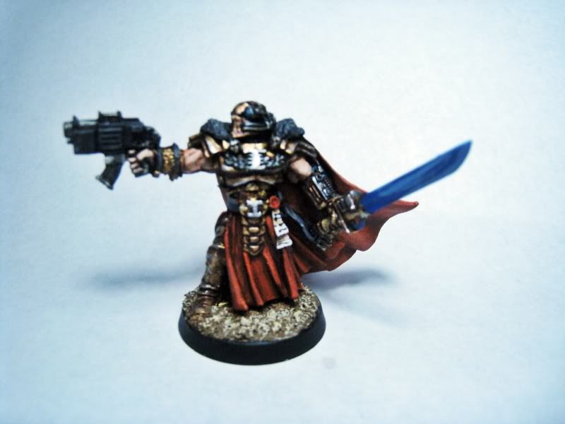
 We'll be demonstrating using an Ordo Malleus Inquisitor.
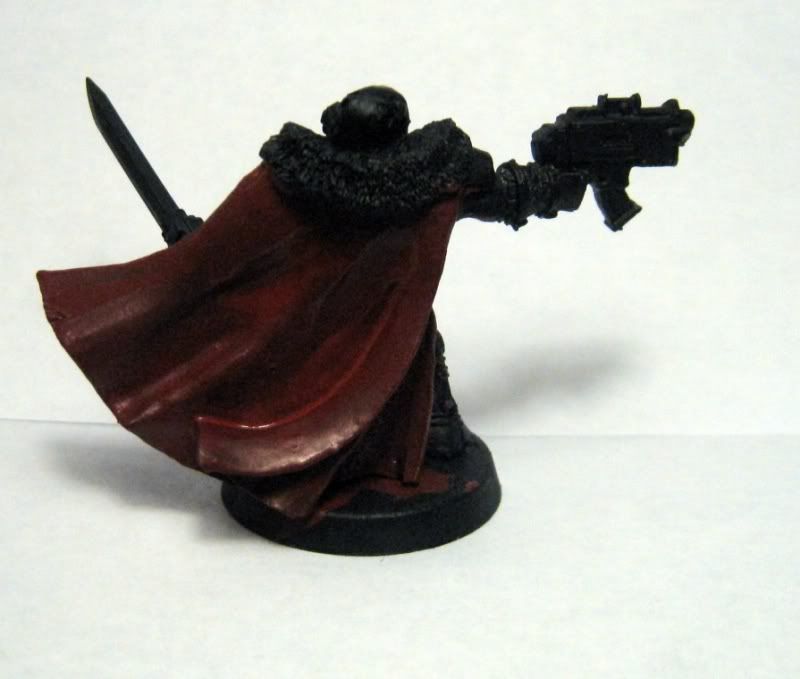
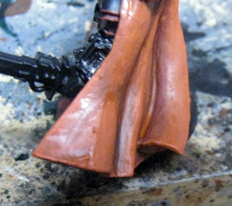
After priming the model black, I started with a basecoat of GW Khorne Red on all the cloth areas. This is a rich mid-tone, and covers well. It’s mostly going to be covered up later, so don’t worry if it’s not a particularly smooth coat.
Next, I apply a layer of RMS Carnage Red, avoiding the deepest recesses. This will be the main color of the cloak.
And then, I apply a highlight of RMS Magma Red. Simple three
stage layering technique. But, as you can see, this is a bit splotchy looking,
and needs to be smoothed out.
I’ll now add a glaze of GW Baal Red (Carroburg Crimson is
the new one, which is significantly darker—if you have the new Shade, be sure
to cut it with some water), and then a glaze of GW Bloodletter. These two steps
together even out the colors, and smooth out the transitions between shades.
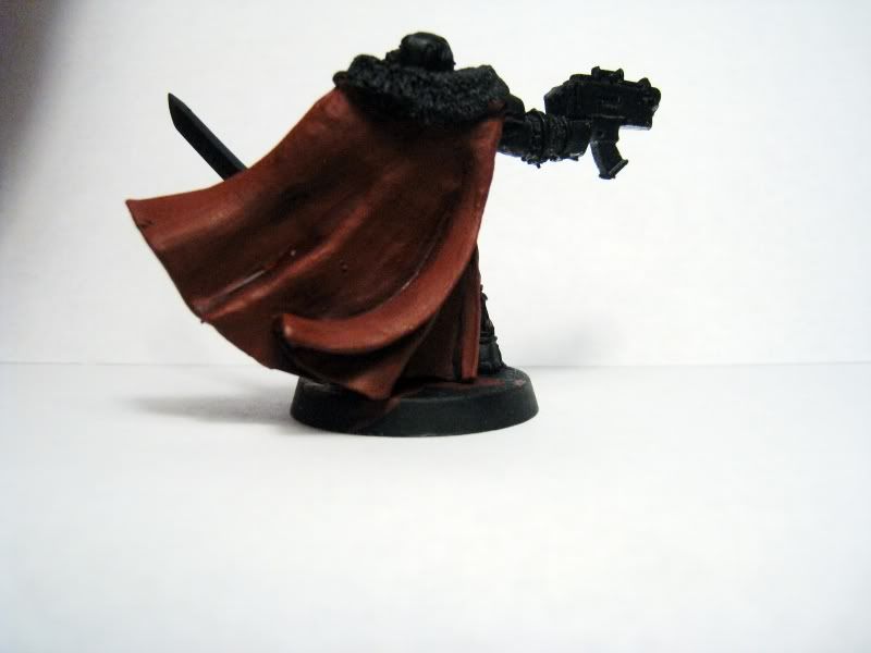
So now, we’re going to do some blending. I’m going to mix up
even parts Carnage Red and Magma Red, to create a midtone between the first
layer and highlight from the three stage process. I’m going to place the first line to be drawn
out on the raised folds of the cloak, and draw it out towards the recess. I use
glaze medium to thin the paint out, rather than water. This gives me more
control over the brushstrokes and maintains an even consistency in the paint—I want
to thin it on the model, not disperse the pigment itself. Thinning using water
disperses the pigment, while glaze medium “floats” the color instead while
keeping the same density of pigment in the medium.
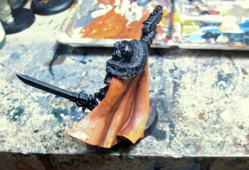
It's easier to see the blending effect on the folds of the cloth from this angle.
It's easier to see the blending effect on the folds of the cloth from this angle.
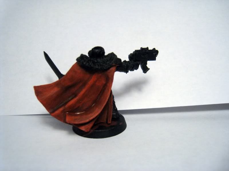
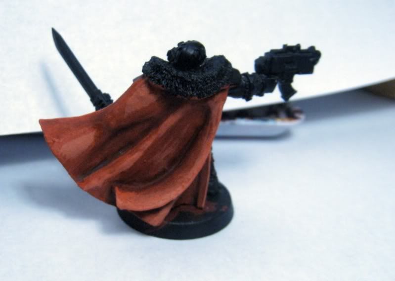
I then "erase" elements of the edges of the previous layer in a manner that's functionally very similar to blending by applying targeted glazes of GW Bloodletter. This creates a distortion effect from light hitting a sheer surface without actually creating artificial highlights on the contours of the model. It also evens out the final previous highlight layer.
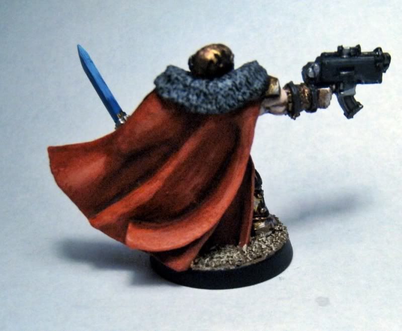
After putting some paint on the rest of the model, we end up with this.
After putting some paint on the rest of the model, we end up with this.


No comments:
Post a Comment